Fourth in a series with loss functions, activation functions and optimization. Those three are about making a model train. This one is about knowing whether it should ship.
Pick your metric before you pick your model. A metric chosen after the fact is a metric chosen to make your results look good, and everyone in the review can tell.
1. The Four Layers
Most metric confusion comes from mixing layers. A model can win on all four or win on one and lose the launch.
| Layer | Answers | Examples | Who reads it |
|---|---|---|---|
| Offline quality | Is the model accurate? | AUC, NDCG, F1, pass@k | You, during development |
| Online / product | Do users behave differently? | CTR, conversion, session length | PM, in the A/B readout |
| Infra | Can we afford to serve it? | p99 latency, QPS, $/1k requests | SRE, capacity planning |
| Business | Did it move the thing we care about? | revenue, retention, ticket deflection | Leadership, the funding decision |
The question this table answers: “your model improves AUC by 3 points, should we ship it?” The honest reply is that AUC is one layer of four, and you cannot answer without the other three. That framing alone separates senior candidates from junior ones.
2. Classification
Start by distrusting accuracy
With 1% positives, a model that predicts “negative” every time scores 99% accuracy and is worth nothing. Accuracy is only meaningful when classes are roughly balanced and both errors cost about the same, which is rarely true in production.
The confusion matrix is the real object. Everything else is a ratio of its cells:
$$\text{Precision}=\frac{TP}{TP+FP} \qquad \text{Recall}=\frac{TP}{TP+FN} \qquad F_1=\frac{2PR}{P+R}$$- Precision: of the things I flagged, how many were right? Optimize when a false positive is expensive (blocking a legitimate transaction, spam-filtering a real email).
- Recall: of the things I should have caught, how many did I? Optimize when a false negative is expensive (missing a tumor, missing fraud).
- F1: the harmonic mean, which stays low if either is low. Use it when you need one number and the classes are imbalanced.
\(F_\beta\) generalizes this: \(\beta > 1\) weights recall, \(\beta < 1\) weights precision. If someone asks “which matters more,” the real answer is the cost ratio of the two error types, which is a product question, not an ML one.
ROC-AUC vs PR-AUC
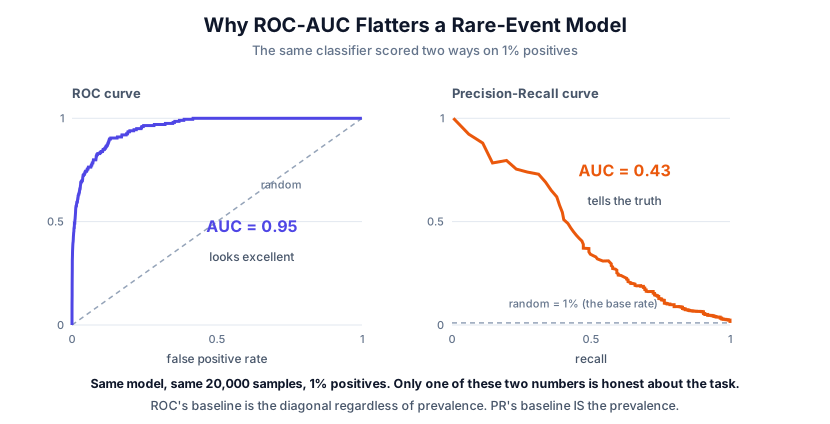
That is one model, 20,000 samples, 1% positives, scored two ways. ROC-AUC 0.95, PR-AUC 0.43. Neither number is wrong; they answer different questions.
The reason is in the baselines. A random classifier traces the diagonal on ROC no matter what the prevalence is, because TPR and FPR are each computed within a class and never see the ratio between them. On the PR curve, random sits at the prevalence itself, 0.01 here. So ROC grades you against a fixed bar while PR grades you against how rare the positive actually is.
Use PR-AUC when positives are rare and finding them is the point (fraud, disease, moderation). Use ROC-AUC when classes are roughly balanced, or when you genuinely care about overall ranking rather than the positive class. Reporting only ROC-AUC on a 1% problem is the most common way to oversell a model, and a good interviewer will ask for the PR number.
The threshold is a separate decision
A classifier outputs a score. The threshold that turns it into a decision is a business choice, not a model property, and you tune it after training.
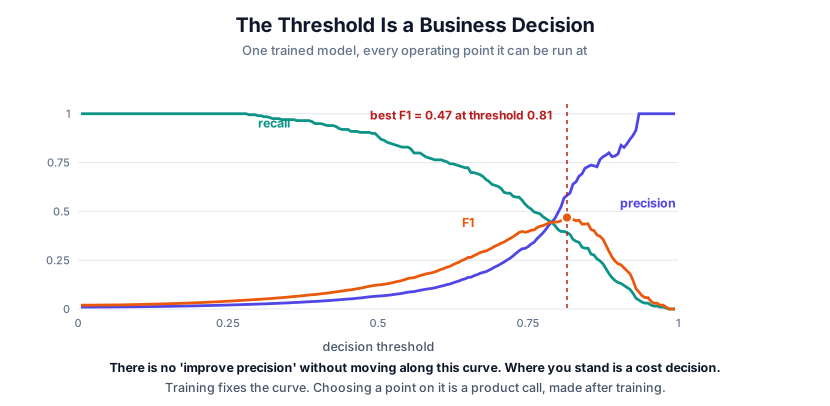
One trained model, every operating point it can be run at. Training fixed this curve; choosing where to stand on it happens afterward and is a product decision. The F1-optimal point here is threshold 0.81, but F1-optimal is only the right answer if precision and recall really are equally valuable, which they usually are not. A fraud team picks a point far to the left and eats the false positives; a medical screen picks further left still.
Trap: “how do you improve precision?” You can raise the threshold and get all the precision you want, at the cost of recall. The question is only interesting with the tradeoff attached.
Calibration
A model is calibrated if, among predictions of 0.7, about 70% are actually positive. AUC does not care about this at all: it only cares about ranking, so you can have perfect AUC and badly miscalibrated probabilities.
Calibration matters whenever the probability feeds a downstream decision: expected-value calculations, bidding, risk scoring, thresholding on cost. Measure it by bucketing predictions into \(M\) bins and asking, within each bin, whether stated confidence matched observed accuracy:
$$ECE=\sum_{m=1}^{M}\frac{\lvert B_m\rvert}{n}\Bigl\lvert \text{acc}(B_m)-\text{conf}(B_m)\Bigr\rvert$$A perfectly calibrated model scores 0. Plotting the same per-bin comparison gives you a reliability diagram. Fix miscalibration with Platt scaling, isotonic regression, or temperature scaling, fitted on held-out data. Note that label smoothing changes the target distribution, so measure calibration instead of assuming the probabilities are usable downstream.
3. Regression
| Metric | Formula | Property |
|---|---|---|
| MAE | \(\frac{1}{n}\sum|y-\hat y|\) | Robust, in the target’s units |
| RMSE | \(\sqrt{\frac{1}{n}\sum(y-\hat y)^2}\) | Punishes large errors, same units |
| MAPE | \(\frac{100}{n}\sum|\frac{y-\hat y}{y}|\) | Scale-free, breaks near zero |
| \(R^2\) | \(1-\frac{SS_{res}}{SS_{tot}}\) | Fraction of variance explained |
This mirrors MSE vs MAE in the loss post: RMSE is outlier-sensitive because squaring, while MAE is less sensitive because errors grow linearly. RMSE is always at least as large as MAE, and the gap between them tells you how heavy-tailed your errors are.
Traps worth knowing. MAPE is undefined at \(y=0\) and asymmetric: under-prediction caps at 100% error while over-prediction is unbounded, so optimizing MAPE quietly biases your forecasts low. And \(R^2\) can be negative, which just means you are doing worse than predicting the mean. On a test set that is a real and common outcome, not a bug.
4. Ranking and Recommendation
Order is what matters, not the raw score. All of these are measured @k, because nobody scrolls.
| Metric | In one sentence | Formula |
|---|---|---|
| Precision@k | What fraction of what I showed was relevant | \(\frac{\text{relevant in top }k}{k}\) |
| Recall@k | What fraction of everything relevant I showed | \(\frac{\text{relevant in top }k}{\text{total relevant}}\) |
| MRR | How far down was the first correct answer | \(\frac{1}{\lvert Q\rvert}\sum_q \frac{1}{\text{rank}_q}\) |
| MAP | Precision measured at every relevant hit, averaged | \(\text{AP}=\frac{\sum_k P(k)\cdot rel(k)}{\text{total relevant}}\) |
| NDCG@k | Graded relevance, discounted by position, normalized | see below |
NDCG is the one worth being able to write from memory, because it is the metric interviewers ask for by name. Two steps:
$$DCG@k=\sum_{i=1}^{k}\frac{rel_i}{\log_2(i+1)} \qquad NDCG@k=\frac{DCG@k}{IDCG@k}$$The \(\log_2(i+1)\) denominator is the position discount: rank 1 divides by 1, rank 2 by 1.58, rank 9 by 3.32. That is precisely what makes a win at the top worth more than the same win further down. \(IDCG@k\) is the DCG of the perfect ordering, which normalizes into \([0,1]\) so queries with different numbers of relevant results stay comparable.
Worth knowing: production systems usually use the exponential gain form, \(\frac{2^{rel_i}-1}{\log_2(i+1)}\), which separates “highly relevant” from “somewhat relevant” much more sharply. If asked which form you mean, naming the exponential-gain variant and saying graded relevance should not be linear is the stronger answer.
NDCG is the default for search and recommendation because it handles graded relevance (not just relevant/irrelevant) and applies a position discount, so an improvement at rank 1 counts for more than the same improvement at rank 9. MRR is the right choice when there is exactly one correct answer and you only care where it landed, which is why it shows up in QA and retrieval-for-RAG.
Beyond accuracy, and increasingly what actually gets measured in industry: coverage (what fraction of the catalog ever gets shown), diversity, novelty, and popularity bias. A recommender that maximizes NDCG by showing everyone the same ten blockbusters is optimal on paper and a failure as a product.
5. Generation and LLMs
This is where metric choice is hardest, because the output space is open-ended.
| Task | Metric | Honest assessment |
|---|---|---|
| Translation | BLEU | n-gram overlap. Correlates weakly with quality |
| Summarization | ROUGE | Recall of n-grams. Rewards copying |
| Language modeling | Perplexity | Only comparable at fixed tokenizer and data |
| Code | pass@k | Actually runs the tests. The gold standard |
| QA (extractive) | Exact match, token F1 | Fine when answers are short and closed |
| Open generation | LLM-as-judge, human preference | Best available, with real caveats |
| RAG | Faithfulness, context precision/recall | Separates retrieval failure from generation failure |
Why BLEU and ROUGE persist despite being weak: they are cheap, deterministic, and reproducible. They are reasonable regression detectors and poor quality measures. Reporting a BLEU gain as a quality win is a claim a good interviewer will push on.
pass@k is the model to imitate. It does not compare text to a reference; it executes the code against tests. Sample \(n\) solutions per problem, count the \(c\) that pass, and report the unbiased estimate that at least one of \(k\) samples works:
$$\text{pass@}k=\mathbb{E}\left[1-\frac{\binom{n-c}{k}}{\binom{n}{k}}\right]$$Read the ratio directly: it is the probability that all \(k\) draws land among the failures, so one minus it is the probability at least one succeeds. You sample \(n\) well above \(k\) and estimate because computing it from exactly \(k\) samples is far too noisy. Wherever you can replace similarity-to-a-reference with did-it-actually-work, do it. That is the same transcript-versus-outcome distinction from the agent evaluation post.
LLM-as-judge, with the caveats stated up front because they will be asked:
- Position bias: judges favor the first option. Randomize order, or score both ways.
- Verbosity bias: judges favor longer answers regardless of quality.
- Self-preference: models rate their own family’s output higher.
- It needs its own validation. Measure agreement with human labels before trusting it, and re-check when you change judge models.
For RAG, decompose rather than scoring end to end. Retrieval quality (context precision and recall) and generation quality (faithfulness to the retrieved context, answer relevance) fail for different reasons and have different fixes. A single “RAG score” tells you something is broken but not what.
For agents, outcome alone is not enough: two agents can both succeed while one took a clean path and the other burned forty tool calls and a policy violation getting there. That gap is the whole subject of the multi-agent evaluation post.
6. Online Metrics and Experiments
Offline metrics are a proxy. The A/B test is the measurement.
Structure every experiment with three tiers:
- The OEC (one primary metric you decided on in advance). One. Not five.
- Guardrails: things that must not regress. Latency, crash rate, revenue, complaint volume, unsubscribes.
- Diagnostics: everything else, for explaining why, never for declaring victory.
The traps that decide real launches:
- The offline-online gap. Offline gains routinely fail to transfer, because offline data was logged under the old policy. Your new ranker is being scored on items the old ranker chose to show.
- Novelty effect. Any UI change lifts engagement for a week or two. Run long enough to see it decay, or you will ship a wiggle.
- Peeking. Checking daily and stopping when p goes below 0.05 inflates false positives badly. Fix the horizon in advance or use a sequential test designed for it.
- Multiple comparisons. Twenty metrics at \(p<0.05\) means one false positive on average, every time, by construction.
- Feedback loops. A recommender that shows more of X generates more X engagement data, which trains the next model to show even more X. The metric goes up while the product narrows.
7. Infra Metrics
Quality you cannot serve is not quality.
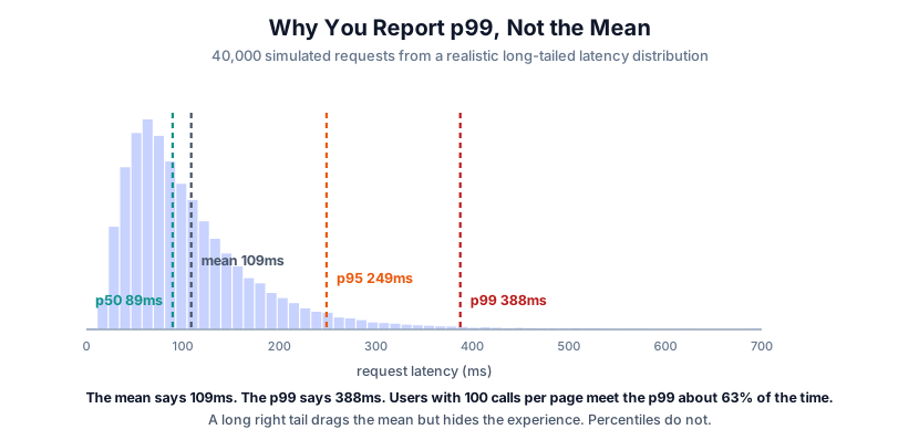
The mean is 109ms and the p99 is 388ms, more than 3x further out. The mean sits near the bulk and tells you nothing about the tail, which is exactly the part users complain about.
Worse, tails compound. If a page makes 100 backend calls, the chance that all of them beat the p99 is \(0.99^{100}\approx 37\%\), so roughly 63% of page loads contain at least one p99 request. The rare case is not rare at the page level. That is why SLOs are written on percentiles and never on averages.
| Metric | Why it matters |
|---|---|
| p50 / p95 / p99 latency | The tail is what users feel. Always report percentiles, never the mean |
| TTFT (time to first token) | For streaming LLMs this is perceived speed |
| TPOT (time per output token) | Sets how fast text appears after the first token |
| Throughput (QPS, tokens/sec) | Capacity per GPU, and therefore cost |
| Cost per 1k requests | The number finance will ask for |
| GPU utilization, batch efficiency | Whether you are wasting the hardware you bought |
For LLM serving, total latency is roughly \(\text{TTFT} + \text{TPOT}\times\text{output tokens}\). Those two are tuned differently, and throughput and latency trade against each other: larger batches raise tokens/sec and raise per-request latency. Knowing which one your product needs is the actual engineering decision.
8. Choosing, in Practice
The order that works:
- What decision does this model drive? If no decision changes, no metric matters.
- What does a mistake cost, in each direction? This picks precision vs recall, MAE vs RMSE, and the threshold.
- Pick one primary metric. Everything else is a guardrail or a diagnostic.
- Check that the offline metric tracks the online one. If it does not, your offline loop is measuring nothing.
- State the budget up front. Latency and cost ceilings are metrics too, and they kill more launches than accuracy does.
9. Rapid-Fire Q&A
Accuracy 99%, is the model good? Unknowable without the base rate. At 1% positives that is the majority-class baseline.
Precision or recall? Whichever error is more expensive. Missing fraud costs more than reviewing a clean transaction; blocking a real payment costs more than letting a small fraud through. It is a cost question.
ROC-AUC or PR-AUC? PR-AUC when positives are rare and you care about finding them. ROC-AUC when classes are roughly balanced or you care about ranking overall.
Offline metric improved, online did nothing. Why? Distribution shift between logged and live traffic, a proxy that does not track the real objective, position/presentation effects your offline data cannot see, or an effect too small to detect at your traffic.
Why report p99 instead of the mean? The mean hides the tail, and the tail is the experience people complain about. If a page issues 100 calls, a p99 per call means roughly a 63% chance that at least one is slow, so the p99 becomes the typical page.
How do you evaluate a system with no ground truth? Human preference on a sample, LLM-as-judge validated against those humans, proxy signals (user edits, retries, thumbs-down, abandonment), and online A/B. Then say plainly which of those you trust.
Can a metric be gamed? Assume yes. Engagement rewards outrage, ROUGE rewards copying, an LLM judge rewards verbosity. This is Goodhart’s law, and the practical defense is guardrails plus periodic human review.
Loss went down but the metric did not move. The loss is a differentiable proxy for the metric, not the metric. Discussed at length in the loss functions post.
The Idea Underneath
A metric is a compression of everything you care about into one number, and every compression throws something away.
Accuracy throws away which error you made. AUC throws away calibration. BLEU throws away meaning. Offline throws away the user. Every one of them is useful right up until the thing it discarded is the thing that mattered.
So the job is not finding the perfect metric. It is knowing precisely what each one ignores, and keeping a guardrail on exactly that.